Triptych

Here are pictures of a small but complex piece of work that I've made for an exhibition organised by and to be held at the Bodleian Library from December: Redesigning the Medieval Book. It promises to be an imaginative and exciting exhibition with work by a variety of book artists, binders, printers, calligraphers, painters. 

My little triptych has been shortlisted which I'm delighted about. At the moment the selection group at the Bodleian is deciding which shortlisted works to accept for the exhibition as only a limited number can be displayed. 
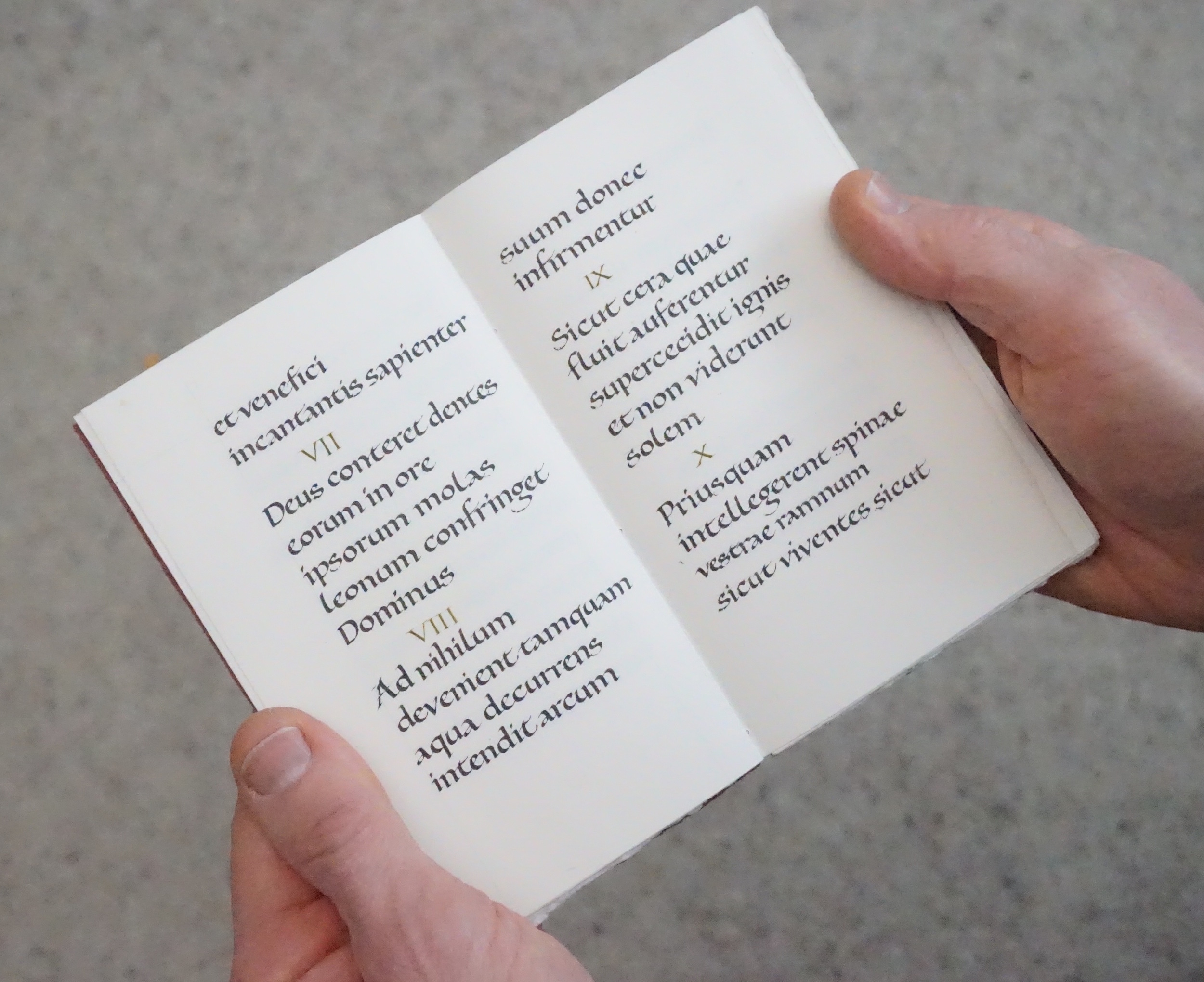


Zig-zag triptych 

Zig-zag triptych 

It is made of wooden boards hinged together with vellum strips so that it can stand in several different ways. Each board is 167mm high and 80mm wide.

hufton_03.jpg
Interchangeable vellum text pages slipped behind the vellum strips.

Interchangeable vellum text pages slipped behind the vellum strips.

I've made several groups of pages that can be put onto the triptych and there are many different possible combinations of text, symbols and shapes.

The texts I've used are some I've worked with many times over the years and incidentally fit together as a theme, appropriate for the exhibition brief. 

As a form, it is useable as a personal meditative and devotional aid. And recently, I visited the wonderful newly displayed treasure of St Cuthbert at Durham Cathedral Treasury having not seen for many years the artefacts found in his coffin. There I saw again the little portable altar that may have belonged to St Cuthbert - and had completely forgotten it was there. It was lovely to see it again in the light of having just made one myself. 

Names


Here are a few of the pieces of embroidery I've been working on. They are names originally carved into stone in ancient Rome, recording people whose identity is long gone but who were real people living intricate and personal lives. Their loved ones carved their names in remembrance; we know nothing about them now but as I embroider their names, I use my imagination and make stories. 

Exhibition work

April 27th 2017

This week I've finished my piece of work for the next Letter Exchange exhibition 'Orchestra of Letters' which opens at The Lettering Arts Trust building at Snape Maltings in June. The exhibition coincides with the fiftieth anniversary of the opening of Snape Concert Hall. I chose words from Benjamin Britten's Death in Venice, Aschenbach's final speech which sums up the themes of the opera. Death in Venice was originally a novella by Thomas Mann and was made into a film in 1971. Myfanwy Piper wrote the libretto (her words are used by permission of Faber Music Ltd, London) and I saw a production at Snape in 2013 created by the Aldeburgh Festival in collaboration with Bregenz, Lyon and Prague and directed by Yoshi Oida. The staging of this production was devised specifically for the Snape Concert Hall which is a simple structure with plain brick walls. The mainly white, grey and black costumes and wooden decking between channels of water gave a clean simplicity and feeling of purity, echoing a theme of the story.


I wanted to hold on to these impressions as I made my piece of work. But that was so very difficult. Time and time again, I had to pare down my ideas and chosen elements so that the work didn't get too visually complicated. It's a long story of what went in then went out, how I had to simplify the layout, structure and technical details. I needed to keep going back to my original impression of the opera, its content and its visual impact on me, set alongside the clarity and simplicity of the music. 

Here are some of the trials that I did and subsequently rejected as being too far removed from my original impression. Useful trials of course, but it is always hard to let go of ideas that one can see potential for.

A page of trials from my notebook

A page of trials from my notebook

In the end, the elements that remained were to do with colour: the brick red of the walls, the hint of blue of the Venice water which came in the lighting of the opera, the white and grey of the costumes and the linear quality of the set and stage. I painted the text onto vellum and it is fixed by tabs that sit between the sides and linings of a box-tray, covered in dyed linen, the outside terracotta, the inside blue/green. Here is a picture of the finished piece - well, almost finished....

....because I decided to add lighting behind the vellum. Throughout this project I'd been in consultation with my brother Rob Kearley who was the revival director for Death in Venice in Snape (and other venues around the world too). He suggested the idea of lighting to me and at first I couldn't see how it would work. He kept gently pushing me though and this is how it looks with the lights on, the vellum becomes luminous and the blue shadow comes through. When the opera is revived in different places, large canvas panels are behind the set, lit with terracotta or blue. The Snape Hall remains crucial to this Opera North's production.

DSC01180.jpg

Writing

For 12 days in July I worked with Richard Middleton and we discussed our writing, looked carefully at what each of us was doing and how we were making and using our tools. This continued the support and trust in each other's work that began during our time together studying at Roehampton thirty years ago and which we have continued over the years, latterly by Skype and email. Our aim was to make a real thing from beginning to end, in this case from a piece of firewood to a finished book. Practice has value if it is real, something that Edward Johnston firmly advocated when teaching his students. We knew it would not be perfect, nothing can be, but our aim was to make something that was as good as it could be, working intuitively with our quills, ink, paint, wood and paper and with little prior planning.

Here is the finished book. Richard made the wooden boards, cut the paper and wrote the text of some Psalms in Latin, I painted the titles and numbers and then bound the book.


DSC00743.jpg

The Calligraphy Society of Victoria's Summer School in Winter 2016

I am preparing to teach two workshops at the Summer School in Winter in Victoria from June 29th to July 3rd 2016. One will be about painted lettering when students will be learning how to paint letters with a pointed brush onto different surfaces using their own interpretation of historical letterforms. The other is about analysing, understanding and then writing a 10th century script, the Ramsey Psalter, with quills on vellum.  


 0 Likes

Binding experiments

I was given an interesting book called 'Bookbinding, Limp Bindings from Tallin' by Monica Langwe Berg showing historical books and interpretations of their structures by binders working today in Estonia. So I've taken the historical structures as my starting point too and made some books of my own. 

This is a small leather pocket book, no glue, only the stitching holds it together. 

Another small pocket book with a leather cover. 

I've been trying methods of binding that use only cloth, not stuck to boards, for the covers and this is a start. Cloth frays and is generally soft and flexible which means that many binding methods are not suitable or durable. This is a soft cover and could be used for informal manuscript books.